McAfee Gamer Security
Taking over design of McAfee’s security product for PC gamers through launch, and learning that the people it helped most weren’t the ones it was built for.
Gamers wanted protection without the performance cost
Gamer Security was built on a premise from McAfee’s early research: PC gamers saw traditional antivirus as bloatware that could slow their machines during critical moments of gameplay, but still wanted protection for expensive hardware. The product had to protect a PC without affecting how it performed in a game.
I joined the team as a design intern after the discovery work was done, and much of the interface was already designed. When the other designers moved to early work on Personal Protection, McAfee hired me full time to take over the product’s design through launch, working alongside a researcher and a content strategist.
A closed beta with a few hundred people showed where the existing design fell short. People misread what the antivirus quick scan was doing and didn’t understand how their actions affected gameplay performance. The App Manager’s option to deprioritize apps using resources caused the most trouble: nothing explained what it did, and people who tried it without that context ran into problems running apps mid-game.
Working with the design I inherited
Build on the existing visual language instead of starting over
With launch approaching and most of the interface in place, I kept the existing visual language and extended it with more detailed interactions where people needed them. The cost was living with decisions made before I joined. The benefit was time to test the parts that were actually failing.
Focus on the two places comprehension broke down
Rather than polishing the whole app, I concentrated on the antivirus quick scan and on gameplay performance impact, the two areas where beta feedback showed people misunderstanding what the product was doing for them. These were the core features of this product and without them we could not communicate its value to our target customers.
Test the words and the interface together
I changed the content alongside the UI rather than treating copy as a final pass, and tested them as one change. People saw the existing and updated versions in a randomized order, so the result wouldn’t depend on which one they saw first.
Making protection and performance easier to read
For the quick scan, I made small interface changes that explained what the antivirus protection was doing and suggested ways to set it up. For performance, we improved the content, navigation, and feedback notifications so people had more context on how their actions affected gaming performance.
The App Manager needed the most work. I ran studies comparing different visual languages and interfaces for deprioritizing apps that were consuming resources, so people understood what deprioritizing would do before it caused problems during gameplay.
It shipped, and the premise didn’t hold up
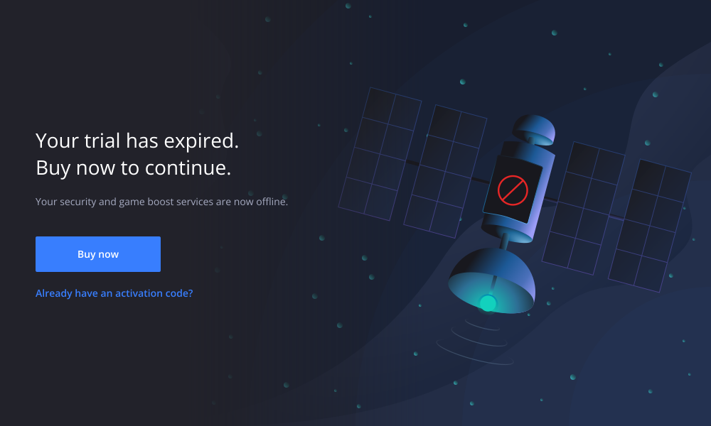
In a usability test with more than ten people, the updated UI and content improved comprehension by more than 70% over the existing version, and the changes went into the product. Gamer Security launched in North America in October 2019.
Soon after launch, the team was moved to other work, and McAfee shut the product down about a year later.
The interviews I ran after taking over told me something the original research had missed. PC gamers, the audience the product was designed for, got little from performance software and often relied on Windows Defender alone. The people who benefited most had lower-end hardware, or wouldn’t have called themselves gamers at all.
One conversation has stayed with me throughout my entire career as a designer. A mother used this product to protect her young daughter, who was just getting into online gaming. The performance tools let the two of them play together on weekends, on a computer that could barely handle it and that she couldn’t afford to replace.
If I were to do it again, I’d be careful when testing who the product was for. We designed carefully for an audience that needed it less than the research suggested. It’s been one of the biggest learning lessons for me as I’ve matured as a designer. Understanding the core user audience for any given feature or product is one of the most important things to get right, but also easy to misinterpret.